U.S. Housing Unit Vacancy Rates
Thematic maps exploring spatial patterns in housing vacancy rates across the United States.
Overview
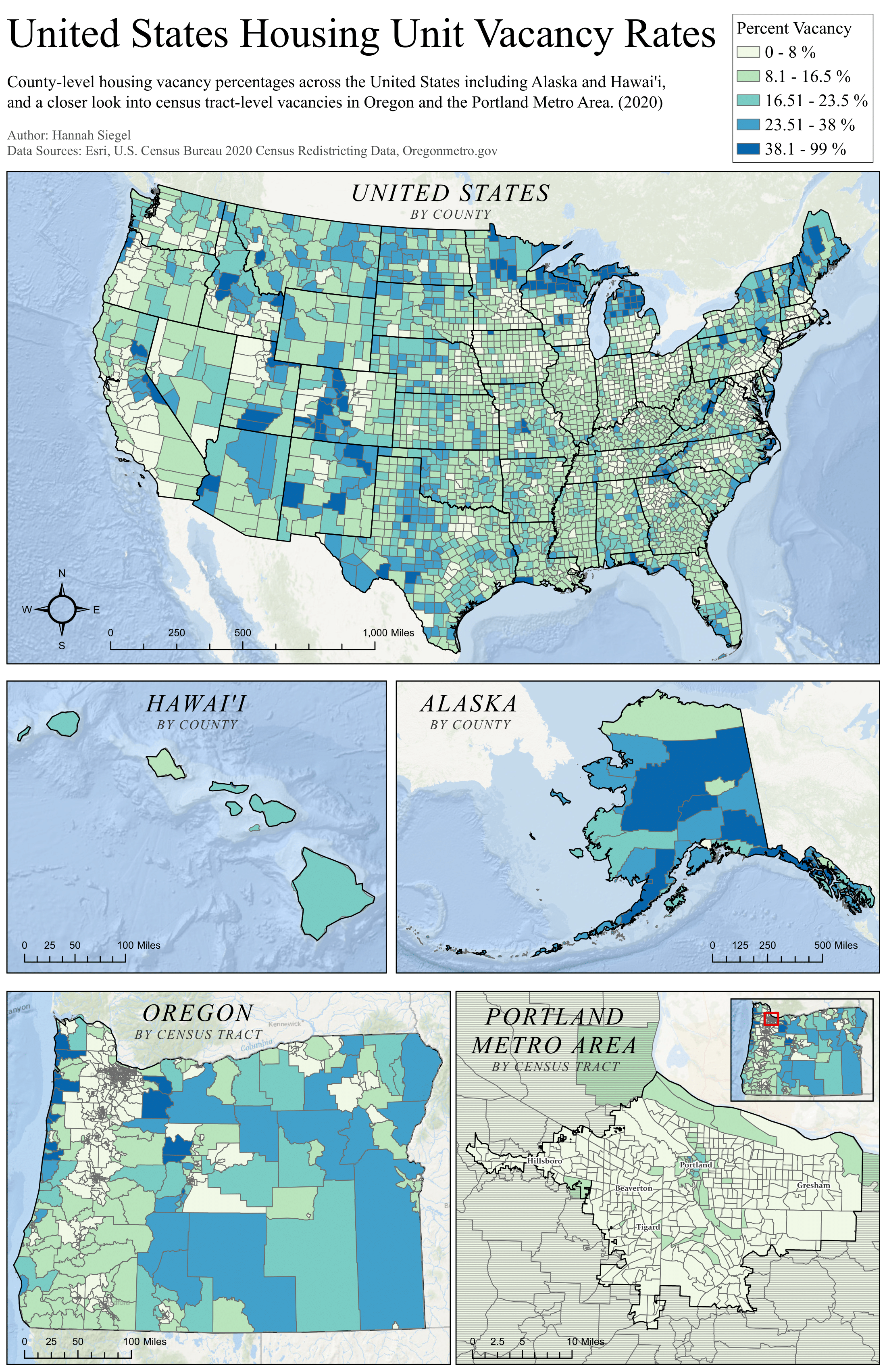
This series of maps visualizes housing unit vacancy rates across the United States, highlighting geographic disparities in housing availability and occupancy by county. Specific states (AK, HI, OR) are also highlighted to show census tract differences.
Cartographer’s Statement
Audience & Purpose
This layout is designed for a general audience interested in housing patterns. The goal is to make regional vacancy trends understandable at a national scale.
Concepts, Narrative, & Design Choices
A choropleth design was chosen to represent vacancy rates by geographic unit using a sequential color palette. I used a manual classification scheme based on an Equal Interval approach, because it best encompassed the varying distributions of data in all five maps (United States, Alaska, Hawai’i, Oregon, and Portland). Although this approach resulted in unequal numbers of data points per class, it better reflected the distribution and skew of each dataset.
Data Sources & Processing
Data were obtained from U.S. Census datasets, and vacancy rates were calculated from raw housing counts, then joined to geographic boundaries.
Reflection
The modifiable areal unit problem (MAUP) is something that affected the visualization of how vacancy rates look at different scales. County-level visualizations can aggregate many census blocks and oversimplify local variation. Inversely, census block-level visualizations show more detail but can also exaggerate differences depending on how boundaries are drawn. Dividing into different spatial units can make the same underlying data tell very different stories.